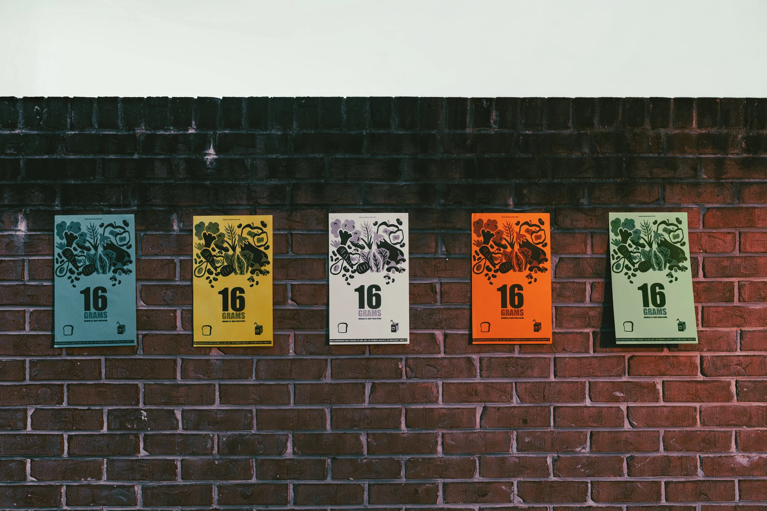
16 Grams
RISOGRAPH SERIES / DESIGN CRITIQUE / FOOD SYSTEMS
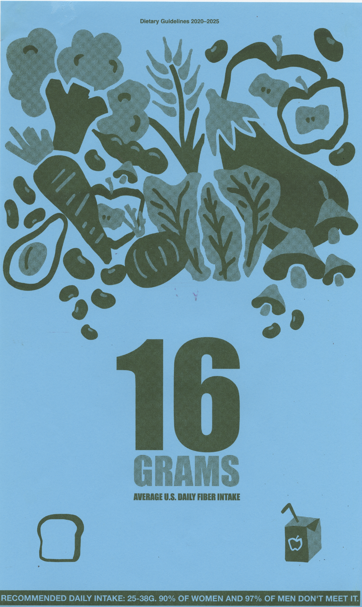
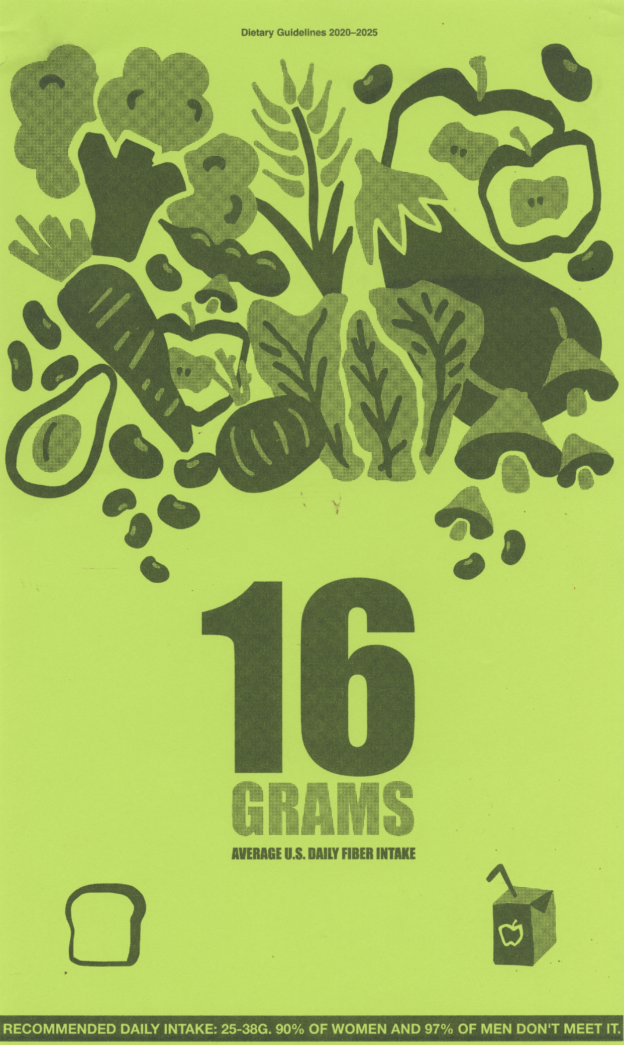
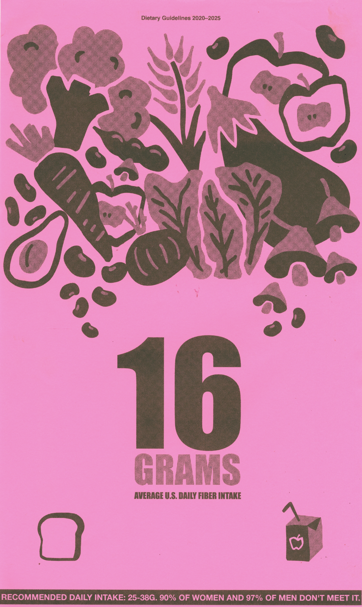
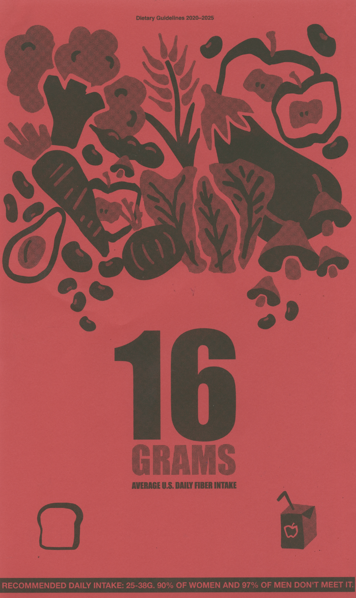
16 Grams is a risograph series built around a single overlooked number: the fiber most people never get. Each poster pairs a dense, illustrated tangle of whole foods with the same blunt headline, "16 GRAMS, average U.S. adult fiber intake," printed in a different colorway across the set. It's part of my research into how quantitative health guidance is represented, and how a number doesn’t mean much until design gives it weight.
Project Contribution
01
CONCEPT AND CRITICAL FRAMING
02
INFORMATION AND TYPE DESIGN
03
ILLUSTRATION AND IMAGE-MAKING
04
RISOGRAPH PRODUCTION
05
Print series
What is this?
16 Grams is a poster series that makes a statistic physical. Its goal is to take a piece of dietary guidance that usually lives in fine print and give it scale, color, and repetition, so the gap between what's recommended and what people actually eat becomes something you feel rather than skim. The series format is the argument: the same number, again and again, insisting on being noticed.
Design Approach
The work starts from a single fact and refuses to explain it away. The illustration piles whole foods into one dense, energetic mass, so the poster reads as abundance first and information second. The number sits underneath, plain and heavy, letting the tension between the lush image and the low figure carry the point.
Produced on a risograph, the series uses the medium's flat, saturated inks and slight misregistration to turn a public-health statistic into something closer to public media.
Designing for Health
Health guidance usually reaches people as numbers with no weight, easy to read and just as easy to ignore. 16 Grams gives one dietary statistic scale, color, and repetition, treating how a number looks as the thing that makes it matter. It's part of my research into how visual form shapes what people understand about their own health.